
Gender pay gap (GPG) is quite a hot topic (before the era of the coronavirus, of course!) and it is, simply speaking, the difference between the salary of men and women. To make it more precise and to avoid any confusion, one should make a crucial classification of GPG right from the beginning, which is, as often as not, overlooked in the media:
Non-adjusted (uncontrolled) GPG: It compares the mean or median of salaries of men and women (for example in different countries and with different ethnicities), ignoring all or most of their differences (like full/part-time position, years of experience, working hours, different positions in terms of seniority, etc.)
 |
Adjusted (controlled) GPG: This is the difference in the salary for equal work and when the only difference between the groups is gender.
 |
Both of these two types of GPG are worth being studied, however, I should highlight their different applications:
Adjusted GPG can be used to study gender discrimination in salary because we compare two groups whose main (only) difference is gender.
Non-adjusted GPG, on the other hand, cannot prove any gender discrimination in salary. There are lots of differences between groups, so, there is no way that it can confirm or reject gender discrimination.
That being said, the non-adjusted GPG can be used for other purposes, like illustrating that women do not earn as much as men, which can guide us towards understanding the underlying reasons, for example, discrimination against one gender in getting higher positions or in the access to the education (which leads to better-paid jobs). Note that, it does not necessarily do so.
Also, note that the adjusted GPG is far smaller than the non-adjusted one, which could imply that the gender’s direct effect on the earning is smaller than other factors living in the non-adjusted GPG. One may call them indirect effects.
So, hereinafter, whenever I talk about GPG I mean the adjusted gender pay gap when everything is the same between the groups, but the gender!
How much is too much?
If a reliable source reports GPG for a survey as 1%, do you consider it as “small”? What about 5%? What about 10%?
I would assume that 1% is not really important for most of us. We might think that it is just statistics, no ones expect 0% difference and always there can be a very tiny random detail which changes the numbers. With 5% feminist and women's right activist will be quite upset, and with 10% perhaps most of us!
The simple but surprising truth is that none of these values is meaningful per se! In one survey 1% can show obvious discrimination while, in another survey, even 10% can be just due to chance, and cannot prove the existence of any gender discrimination!
That was the conclusion I wanted to make out of this post! Now you know the result, let’s explain why it is so!
Let’s ask help from Mann-Whitney-Wilcoxon Test
Mann-Whitney-Wilcoxon is a statistical test telling us if the difference between the two groups is really significant or it is just due to randomness or chance. So, the survey is likely no to support gender discrimination. Look here for an introduction:
We consider four difference cases:
- Small GPG which is not significant → not surprising (Example A)
- Small GPG, which is significant → surprising (Example B)
- Big gap, which is not significant → surprising (Example C)
- Big gap, which is significant → not surprising (Example D)
Examples B and C are more interesting, as they come with a surprise and contradict our intuition.
Now, we investigate these 4 examples in details. Each example consists of two groups of men and women, each with 25 samples.
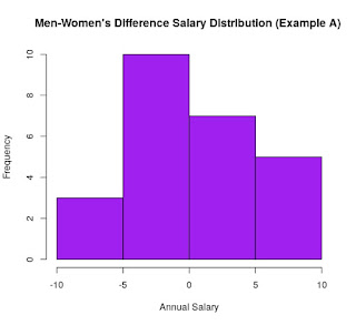
Small GPG which is not significant
The mean difference between groups is 1% in favour of men. Here, you can see the distribution of the salary for each group as well as its difference:
 |  |
Here is the quantile for each group, which does not show much difference between men and women:

So, quite naturally, one would not expect this small difference to be significant. This guess can be confirmed by the Wilcoxon test:

The main point here is the p-value which shows that if everything was due to the chance, there was a 69% chance that we get a difference as big as this 1% between groups. So, we conclude that this 1% is very likely to due to chance.
Small GPG which is significant
The mean difference between groups is 1% in favour of men. But as you can most men earn quite close to the mean (55 K) and there are few men who earn more:
 |  |

The quantile also shows a difference between groups, as women's salary is always below men's:

The Wilcoxon test confirms that this small difference is significant, as the p-value is almost zero, which shows that the chance of getting such an extreme and strange case is very small (67 over one trillion!)

Big GPG which is not significant
The mean difference between groups is 12% in favour of men but the variation in men's salary is quite high.
 |  |

The quantile also confirms that the distribution of men's salaries is quite wide compared to women's:

In fact, this is the reason which makes this big GPG non-significant, as the Wilcoxon test shows:

It says that there is a 20% probability for this to happen simply due to chance, and this is too high to be considered as a real significant difference between the two group! So, even such a high difference may not prove gender discrimination!
Big GPG which is significant
This looks quite expected! The mean difference between groups is 19% in favour of men:
 |  |

Let's look at the quantile, which shows a quite big difference:
 |
| Add caption |
Then, the Wilcoxon test confirms that the difference is not likely to happen due to chance as p-value is very small, 0.0002!

What do we get from all these?
We showed that a small difference can be significant while a big difference can be non-significant. So, we should not claim or reject the gender pay gap (or similar difference/discrimination-based statements) only based on the absolute value of a difference! Numbers can be misleading, remember!


